New Mediums
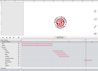
Tumult’s Hype HTML 5 Timeline
Not long ago, it was enough to design a logo, and some stationery, in order to publish your existence, and to tell the world what you had to offer. You physically shopped your demo reel or portfolio to clients, either personally, or via mail. The production of those demo materials were relatively easy, because you used the same talents and techniques that you used to create the work that you were promoting, and you output your portfolio in the same medium that you output your actual work. This is no longer the case, of course. Your professional face to the world, particularly when marketing yourself, is through the internet. Unless you’re willing to part with some sizeable cash, anyone in design who works outside of the web design field, must at one point or another, become a ‘Web Designer’. There’s no escaping it. This is true for anyone working in any creative field, including video & film production.
Certainly, there are several templated tools available, but generally, what you trade for simplicity, is the freedom of specific design control. Thousands of companies with “drag-and-drop” web design templates, exist, and most of them have some really nice looking layouts, but you’re usually married to a certain set of looks, be it color, font style, etc. This is great for any business that doesn’t trade in image creation for it’s product. A lawyer, for example, or an accountant would do well to go with one of these design-by-robot sites. But we’re in the business of designing an image, a look, a feel.
It’s not enough for a graphic designer to say, “Yeah, Verdana is close enough to the font that I have in my other design collateral.” It isn’t ok for a photographer to say, “Well, I really don’t like the look of the gallery template offered, but at least it gets my photographs out there, online. It’ll do.” You get the point. No one who does any kind of high quality image creation, will settle for the free, fast, and easy options that are out there. We waste too many hours of our day sweating over the details on our client’s projects, to not give our own product the same obsessive attention. Thus, it becomes necessary to learn a few new tools, if we are to accomplish the creation of an image that we want to present to future clients, and indeed, to the whole world. If you haven’t done it yet, trust me, it’s a pain in the ass, though a pain worth suffering a little.
I come from an area of design, where everything I make, looks exactly the way it does in my studio. Exaclty. I can guarantee you that everything I put on screen, will be seen as designed, on every screen in the world, whether it’s on a iPhone or a Jumbotron screen. There are a few, very basic rules when producing content for TV, to make that happen. It’s easy. Web design… not so much. Sure, there are pros out there in web design, that can make the same claim that I make about TV, but I am really and truly not interested in becoming a web design pro, particularly so I can design a single site, for myself. I can’t imagine anyone else would, either.
When you lay down an image on video, you’re done. Upload the file, and watch it play to the masses. When you publish a page to your site, however, you’re only ‘mostly’ sure that you’re done. A web page is more dynamic than a finished video image. It can be altered by the smallest of things (fortunately and unfortunately). Bits of code can hang you up, and wreck havoc on the entire function or look of a page. Good luck finding the problem, even on a good day. Something that worked fine yesterday, doesn’t today. The reasons can range from human error, to server error, to a software update, to the type of browser the viewer is using, to nothing in particular. At times, it’s like trying to keep a three year old happy. Then there are the trade offs: file size, fonts, colors, etc., and for some weird reason, you even have to consider the rarely used (but somehow still in existence) ‘Internet Explorer’, and how it seems to never be able to handle anything without bitching (“Do I really want a client who still considers Internet Explorer as a viable browser?” I asked myself). To me, Internet Explorer seems to be the VHS tape of the web; outdated, and ugly.
So when I approached the redesign of my site, I knew just enough about designing for the web, to be a notch below dangerous. I knew that I wasn’t all that interested in learning code. I knew I wanted something more than just a static, lifeless page that stored my demo reels, and I knew that HTML 5 would allow me some level of animation, while not bogging down the user experience. The trick was finding something that could produce the code behind the scenes (and without me), while allowing me to design in detail. I wanted something similar to the tools I used to create the work I was promoting.
Tumult’s Hype HTML 5 Timeline
I had toyed around with Tumult Hype a couple of times, just to explore the features. It was a bit like Adobe After Effects in that it’s timeline and keyframe capabilities were similar, enough. There were even ‘effects and filters’, that it called ‘actions’, which could be tweaked, within the program. Best of all, it wrote the damn code… without me! So I went about designing my site, while learning the intricacies of the software. It was a good challenge, and in no time, I knew the software well, and had a design with which I was happy. If you’re reading this on a laptop, or a desktop, you’ve seen the design I’m talking about. If, however, you’re on a mobile device… well, that’s another story.
As I said earlier, if I make a commercial, it will play everywhere, on all TVs, regardless of size. So, when I had the page layout and design that I wanted for this site, my hope was (ignorantly, as it turns out), that the look and design would transfer over to mobile devices, as well. What I didn’t consider, was the fact that all of these devices not only displayed web content differently, but (obviously) they can also be turned, from portrait, to landscape. That’s where what I had designed, fell apart… badly.
An image only a web designer could love.
A week or so of research followed, looking at scripts and code that would mangle my site, into submission. Code is a thing that can suck you in, and in no time, have you going down some very dark rabbit holes particularly if you have no love for (or even passive interest in) code. And that’s where I stopped, and reassessed my goals and audience for this site. I did not want to learn how to write code. I was NOT going to write code. That was one of my goals, from the beginning. The main goal, however, was to create a clean, simple site that featured my work to those that were looking for someone with my talents and skill set. As with any visual medium, in the end, communication is the only true goal. Thus far, anyone looking at my site on a desktop or laptop, got a full experience of my site. But were these elements (particularly the animated portions), the best solution for mobile devices? Maybe not.
If you look at an iPhone screen (even the large, cartoonish iPhone 6 Plus), you’ll see a balance must to be struck between the content, and anything decorous, such as animation. The more of one, the less of the other. Phones are not going to be so kind as the screen of a computer. I checked out a few other mobile sites that had animation, and most were garish, gimmicky, and a little light on the information that one would really expect to find. I soon concluded, that to achieve what I wanted on mobile platforms, I would have to design a separate, non-animated version of my website.
Again, I looked for software that could do the job, in a familiar (as in a Photoshop/Illustrator-like) environment. I wanted something that would allow me to design for tablets, and phones, and that would also generate the code for me. I found Adobe Muse sitting in my Creative Cloud collection of software, and it fit the bill. I learned how to use it in under an hour. It allowed me to make reasonable previews of several devices, and I was able to bring in Illustrator artwork as an SVG. While I’m well aware that it’s not the worlds most robust web design software, I really had no desire to learn Adobe Dreamweaver just to build one site.
When all of the designing was complete, I still had quite a bit ahead of me, before I could launch the new site; social media, tags, etc. Each had their own nuance, and obstacle, but all were doable. While I came perilously close to having to edit/write code, a few times, I ended up staying mostly true to my goal, and merely had to alter a few bits, here and there. While I didn’t have an animated site for every conceivable device in existence, I did achieve a consistent message across all platforms. I communicated what I wanted to communicate, precisely. You have to be happy with the flag under which you sail, and I can say that I’m happy with with this particular ‘Jolly Roger’.
Would I want to do more of this, or maybe work further to add web design to the arsenal of services that I offer? In a word; no. More accurately, in two words; absolutely not. But, I do believe that in a couple of years, when I inevitably set out to redesign this site, I am confident that a lot of the random, inconsistent, trial and error, code based creation will have given way to even more ease of use for actual visual designers. That’s a good thing. We used to need someone with an electrician’s certification to record music. Now artists control recording. Granted, that hasn’t always brought about better music, just as a ‘less code jockey/more design artist’ world wont always provide us with better internet experiences. But it will give those of us with an eye for design, the ability to spend less time on the behind-the-curtain, tech issues, and more time to spend on the things that matter to us… communicating a vision.


Leave a Reply
Want to join the discussion?Feel free to contribute!